A guide to Control Charts
Also known as ‘Shewhart charts‘. A process improvement tool that tells you when to act by measuring your performance in the form of plotting process variation. This is the boundaries between your optimal process performance and your lowest ‘normal’ performance based on previous experience.
How to use a control chart
Based on previous data, set the parameters of your expected performance (99.78% likelihood).
Plot your process variation on a control chart. Mark on your expected performance parameters.
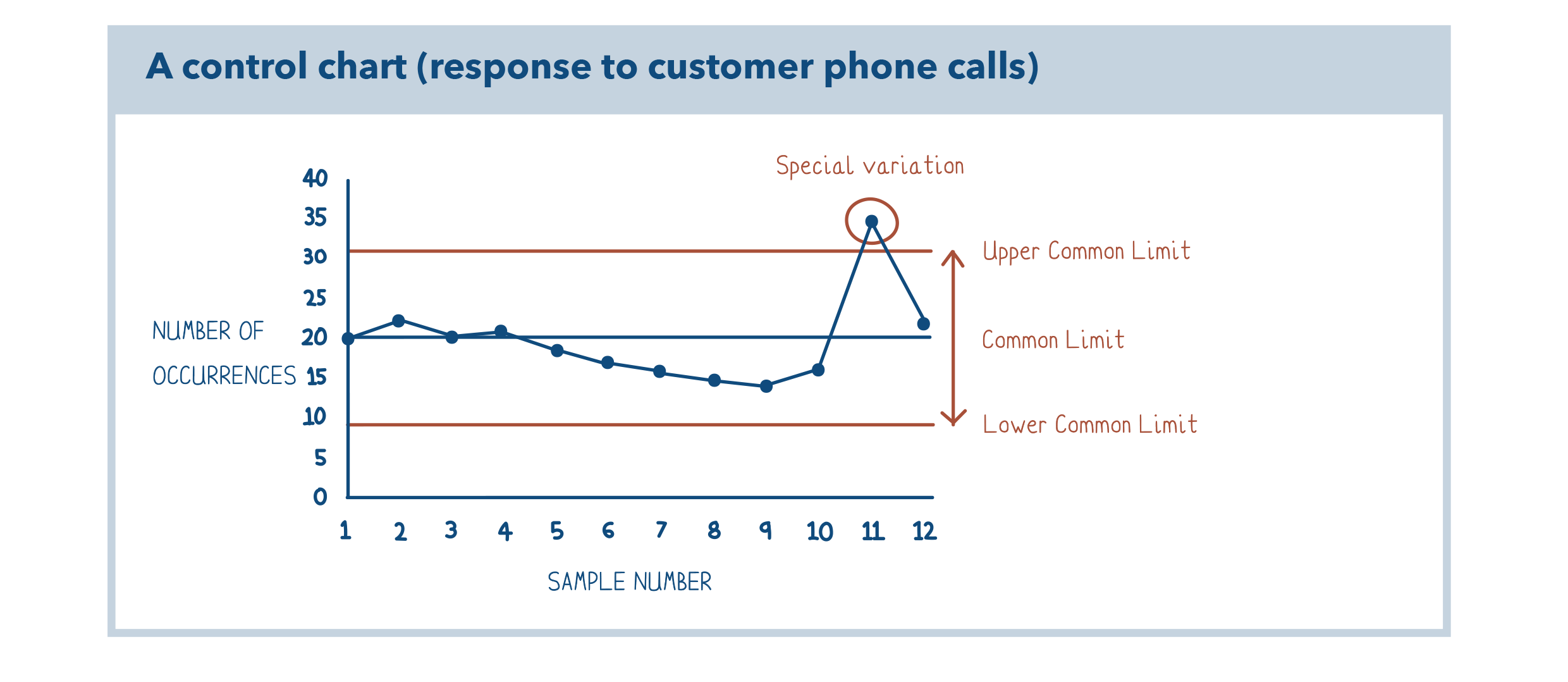
Circle any plots outside your parameters and label as ‘special variation.’ These occurrences should be investigated and eliminate the root cause of the special variation.
Watch Gurdeep Gahir (G)’s video tutorial below to see how to set up and use your control chart.
Your outputs
Control charts literally tell us when we need to react to performance figures, by highlighting the numbers that are outside of expected performance parameters. The objective of the control chart is to understand what is ‘normal’ and therefore highlighting special causes of variation, and to then target performance improvement efforts around these variation points.
An example of a control chart
If you want to reduce the time it takes to respond to your customer phone calls, you will begin by measuring the time it takes to respond to each customer. Those results can be plotted on a control chart over time. See the chart above.

